INFO
During my quarter-long course (INFO 498 F: Applied Product Design), I took on the role as product designer and individual contributor to work on a real world design task from start to finish. I selected the following design prompt and created the final high-fidelity design after iterating through four sprints: user research, concepting, user experience design, user interface design.
Design Prompt
“As more locations reopen from lockdown, Starbucks has set a goal to increase percentage of mobile ordering to 85% (up from 50%). Explore some ways to improve the mobile ordering experience and reduce friction to users ordering via their devices.”
PRODUCT RESEARCH
Statistics, target audience, & app comparisons
Apple App Store Statistics
— #7 in Food and Drinks
— Overall 4.8 stars rating
— 3.7 million ratings
— Editors' Choice Awards
Before diving into the first official sprint, I conducted product research on the Starbucks app by looking at the Apple Store statistics, mobile order transaction numbers and analyzing the main target audience to better understand the history and context of the app.
Just by the statistics on the left, it's evident that the Starbucks app is an overall leader in its field, making it challenging to find improvements.
According to a research conducted in 2018 by eMarketer.com, the Starbucks app was "most popular in-person or "proximity" mobile payment method overall, with 23 million people in the US making purchases at least once every six months". eMarketer also finds the largest group of mobile-payments users in the 25-34 age group.

I compared three of my most common food ordering apps (from left to right): Starbucks, Chipotle, and Panera. Here are the notes from comparing the three home screens.
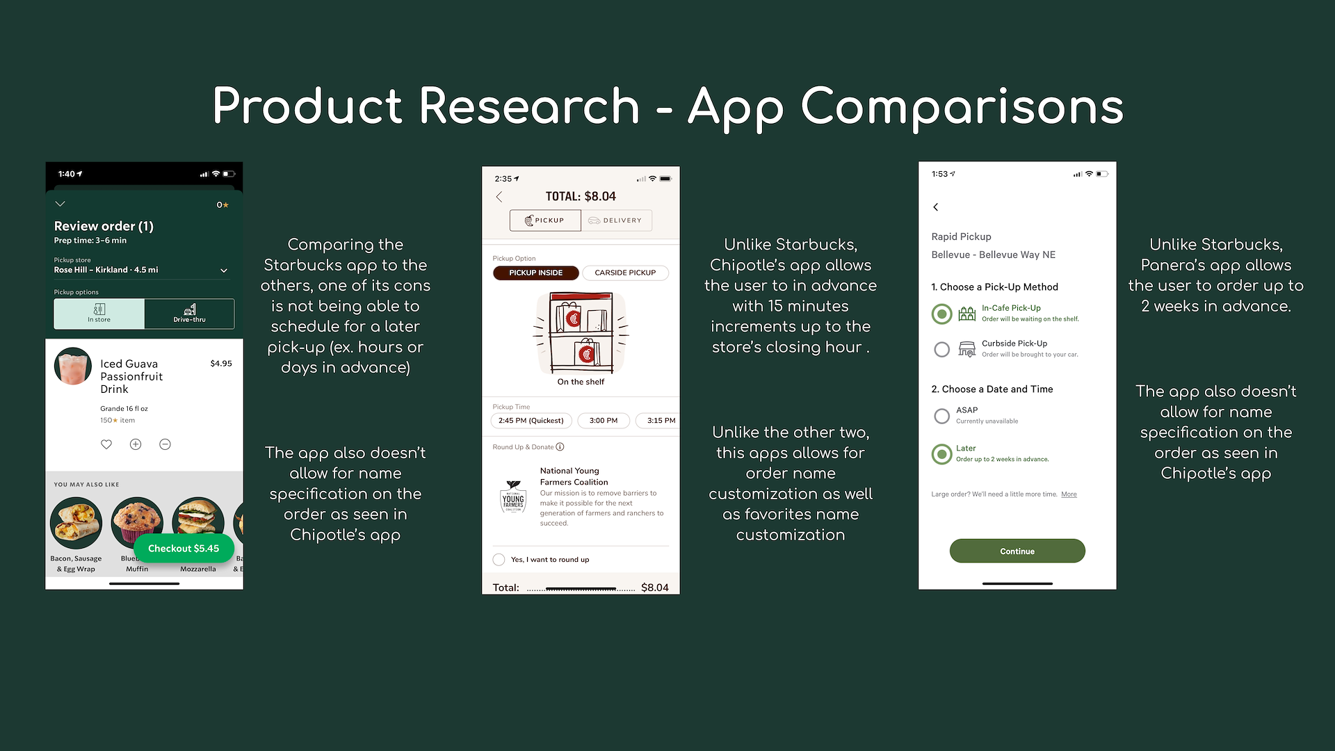
Here are the notes from comparing the screens to select the ordering method in the same order as image above.
CONCEPT IDEATIONS
Following product research, I brainstormed five potential concepts that I could design for. The first three are underlined as those were the ones selected for user research feedback and persona design, but I decided to only pursue the first two which is why they are bolded.
- Concept #1: Ordering in advance
- Concept #2: Automated ordering
- Concept #3: Voice ordering
– Concept #4: Drink ratings/reviews
– Concept #5: Order name customization
After selecting two concepts, I decided to focus my scope on building around convenience through ordering in advance and automated ordering for the 18-35 age group, in hopes of mobile orders increasing by 50%.
Concept #1 (initial ideation)
Goal: Allowing users to order farther in advance than the ASAP option for users to plan ahead

Concept #2 (initial ideation)
Goal: Allowing users to set a recurring drink that is ordered at the same time/day

USER RESEARCH
I interviewed/surveyed five individuals with ranging experience using the Starbucks mobile app by asking open-ended questions regarding their experience and asked for feedback on my proposed concepts.
Although the interviewees' visits ranged from once a week to once a month, some noted that they visited more frequently prior to the pandemic. Users enjoyed the app because of its fast and convenient mobile ordering along with drink customizations, nutrition information, and star rewards program.
Three out of the five users stated no overall challenges using the app, but challenges mentioned by others included menu stock occasionally not reflective of store inventory and having difficulty finding menu items with minimal filtering options.
There was an overall positive feedback for both concept #1 and #2. Concept #1 (ordering in advance) could be used frequently by working professionals. However, some stated customers may forget their order, so adding a notification would be a helpful reminder. Concept #2 (automated ordering) was stated to be more suited for customers who visit habitually, but could provide great convenience for users who don’t have time to sign in to the app every time.

From my research, most users utilized the app for its mobile order and payment features.
PERSONAS
Three sketches and finalized personas to illustrate the each user’s needs for the selected concepts


SKETCHES AND USER-FLOW DIAGRAM
Explaining the layout and navigation from one information screen to another
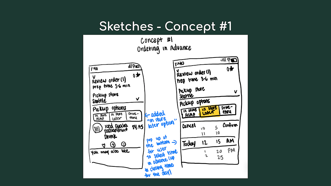
Adding an “in-store later” option to the existing ordering screen for users to select a later time to pick up the drink
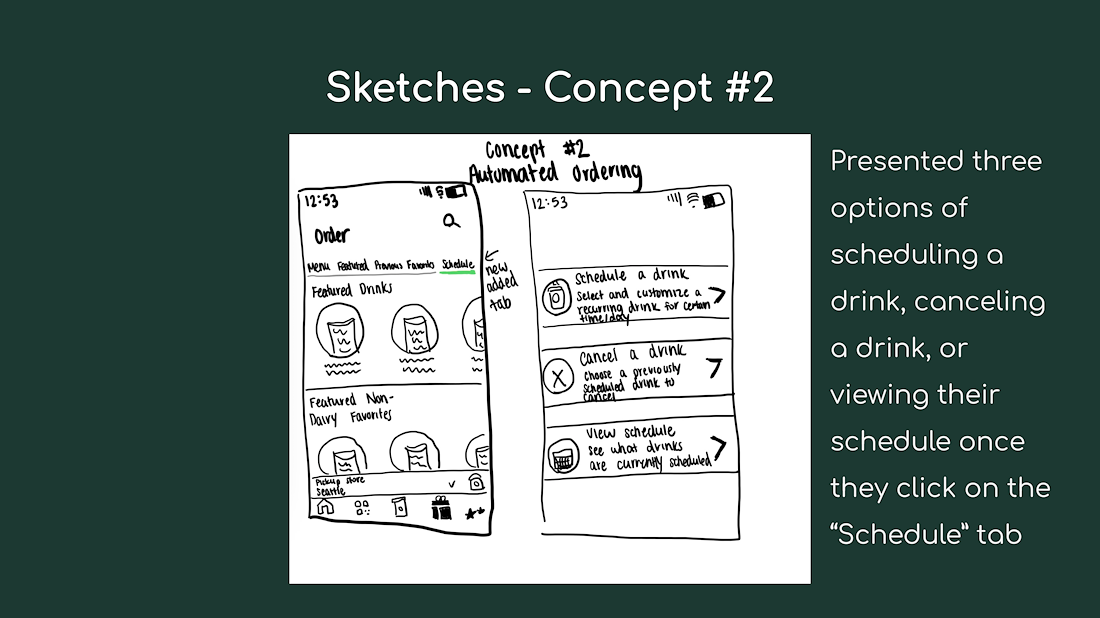
Adding a “schedule” tab to the existing order page, directing users to choose whether they would like to add, edit, or view their schedule
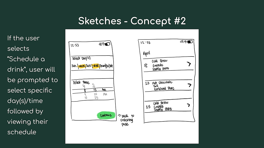
Prompting the user to choose which day(s)/time to schedule a drink and what the potential schedule would look like
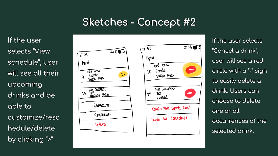
Showing how the user could edit their existing schedule
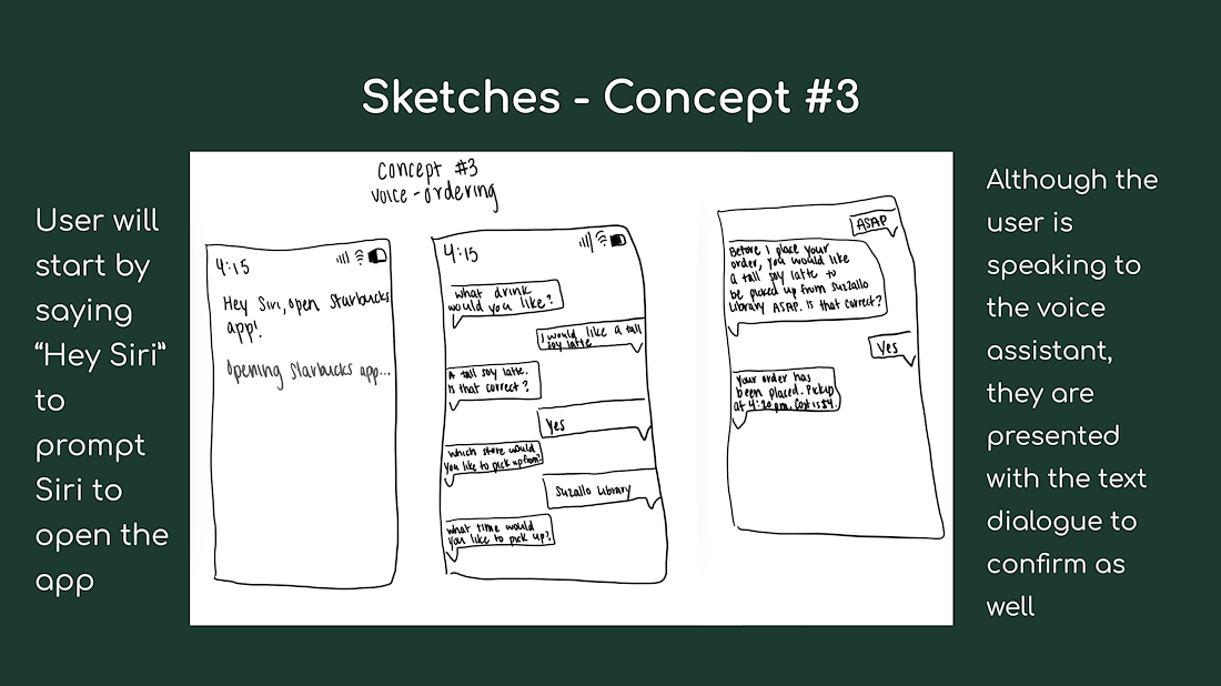
Describing the dialogue with the app’s voice assistant to order a drink

User-flow diagram created with Miro to illustrate the navigation of the different information spaces.
USER EXPERIENCE VALIDATION
I shared my initial grayscale low-fidelity Figma prototype with three users to have them try to complete two tasks: ordering a drink ahead of time and cancelling a recurring drink. The users provided feedback about their experience in a Google form.
For the first task of ordering a drink ahead of time, most noted the experience as "simple and straightforward" and "pretty easy for the first time users" which was excellent feedback to hear. However, some did not that words were not eye-catching enough and some spots required more focus which was later improved in further iterations.
The second task of cancelling a recurring drink caused more confusion for the users, specifically with how the features worked in the editing portion. Some noted that the minus button to delete a drink was hidden and there was confusion with deleting all occurrences of a drink as certain drinks still appeared.
These were the next steps in iterating through my design:
– Revise the second task's process and wording
– Add color theme
– Include graphics (ex. drink images)
– Enlarge text
– Ensure buttons are visible and easily clickable
– Reduce the ways each tasks
Below are some of the screens shown in the user validation testing.


USER INTERFACE DESIGN
My first step of UI design was implementing the next steps and feedback from my user validation testing into the revised low-fidelity prototype. Some of the notable changes from the initial prototype include matching to the color scheme of Starbucks app, improving the process of scheduling a recurring drink, and ensuring all text and buttons could be easily read.

Some of the screens in my revised low-fidelity prototype on Figma
VISION BOARD
Before diving into designing the high-fidelity screens, I created a vision/mood board to explore more of my design prompt through research and be inspired by different colors, designs, and patterns I wanted to incorporate. I pulled color themes and fonts from Starbucks Creative Expression to better understand how Starbucks brings their brand to life. I also found inspiration from other designers on Dribble in their Starbucks UI redesigns. I took screenshots from these websites along with the app itself to create this board to guide my design.

Vision board for high-fidelity UI design
STYLE GUIDE
Following the vision board, I created a style guide to define the design guidelines I would be using for the UI design including a consistent layout, color, typography, and design patterns.

Style guide for high-fidelity UI design
HIGH-FIDELITY KEY SCREENS
Three screens to encompass the overall redesigned-experience
On the left, I added an “in-store later” option to the existing review order page for users to pick up a drink at a later time that day. Once the option is selected, the user can scroll through the time selection widget at the bottom of the screen.
In the middle, is the user’s schedule of recurring drinks. The user can set a designated time and location for each drink. As seen in the screen, the user has a recurring Iced Guava Passionfruit Drink scheduled weekly starting on May 1 to be picked up at Evergreen Village at 2pm.
On the right, are the options presented for the user to schedule a future recurring drink or view/edit their current schedule. The screen also shows the user’s upcoming scheduled drink.
